What is ;paranoia that other publishing houses are not?
;paranoia publishing is a metamedium. besides producing printed matter, we deterritorialize every single phenomenon in the broad field that connects text production and consumption, usage of language, words, letters and punctuation marks, the imperative notion of literature and ego-centred narrative techniques, the post-market situation, the current indie-publishing wave and books as tactile multiple artefacts (we do exclusive small editions, usually from 50 to 500). we value the self-filling of the text, and question the established hierarchies of meaning within the semiosphere.
instead of a homogenetic perspective, we model a space of dynamic interpretations on the polysemic horizon at a certain level of different and distinguishable structural, material and political apparatuses.
we function as a black square, as a gateway to untitled experiences and as a network of cognitonauts.
Your co-operation with the designer Tuuli Aule began back in 2004 when she designed your book Roboti tee on nihe / Salatühik (The Way of the Robot is The Shift / A Secret Void), which is very unconventional in form and content: the text is ordered in a way that it can be read in an infinite number of ways. Could you describe the design strategy you have applied for ;paranoia products?
possibly the most insane content in the most clinical, minimal, rigid, normative, conventional book-like form possible.
to give power back to the text, create imagery without visuals.
the shapes of the books are inspired by geometric figures to underline the contrast between the streamlined shape of the body and the geometric shape of the book. reading comfort is guaranteed by the unique design, with an emphasis on comfort and ergonomics. as the books adapt so smoothly to the body’s shape, they feel like part of one’s body.
Besides the distinctive design, what other elements have you applied in the branding of the publishing house? What’s the role of the “para-twins” and the writer’s “isolator”?
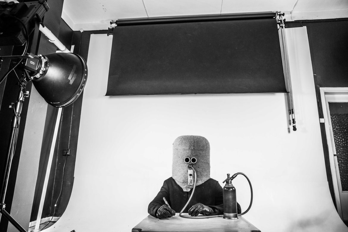
the isolator and twins play central roles as the mascots of ;paranoia publishing not because it was meant to be so, but because our clients love them, which confirms the humanoid pattern. like pavlov’s bitch gazing into tarkovsky’s mirror on the planet solaris. epic contact with the mysterious stranger.
the twins symbolize the cognitive shift in pattern recognition. identification as “becoming something” and the transpersonal dimension.
the twins are like dynamic processes in a given spacetime. to have a cognitive experience, rhythm patterns are necessary. all life, which can be observed as a certain medium, is determined by the timing of energy. rhythmic patterns are the division of energy. brainwave synchronization occurs for the same reason.
the isolator is a personal white cube for productive alienation. cutting off outside stimuli is a perfect condition where the mind experiences the void and starts hallucinating. the isolator is modelled after hugo gernsbeck’s prototype from 1925.
What’s the import-export strategy of ;paranoia? Which writers and artists do you generally choose to publish and what is the target group for them?
;paranoia publishing group ltd. is a major international publisher, providing statistically the most abnormal texts in the contemporary literary market.
as an agency, we offer platforms, contexts and professional services for authors: production, distribution and promotion.
we provide our clients with carefully selected textual operations:
– the most psychotic transborder dataflows
– irreversibly immanence-crossing deterritorialization
– a breakbeat of meta-meanings and hallucinating psycho-geographies
– experimental and non-creative literature, printed matter and text art.
our aims are responsible action, consumer satisfaction and the destruction of reality.


