Dense snow is beating against the car window, the wind is howling and pushing the car towards the edge, and there are icy bumps on the motorway, which make the car jump – a struggle to keep the car on the road. I quietly curse the car repair shop that closed at six on the dot, leaving a sad queue of drivers waiting at the door, for whom the first snow arrived unexpectedly and whose cars still had summer tyres. At moments like this, you just expect the motorway to take you quickly and safely to your destination. Luckily, there are perhaps only two or three such unpleasant moments each year.
Art is everywhere!?
Motorways are planned on the basis of the Acts of Planning, Road, Traffic, Building, Public Health, Water, Earth Deposits, etc. Designing a new motorway in Estonia is a relatively infrequent task: a village detour, or access to a new harbour, enterprise, shop, quarry, waste disposal site etc. The main job is to maintain the motorways – road work has grown according to the needs of traffic.
Building a new motorway depends on the need, starting and finishing point, land use (private or state land), relief (hills, valleys and swamps), geology (peat/limestone/sand/clay),hydrology (rivers, lakes, groundwater and surface water), volume and composition of traffic, environmental protection (protected areas), heritage conservation, and the demands of the owners of utility networks and local governments. In this maze of wishes-requirements-orders, the contractors and designers of a project must find a compromise within the state’s financial means.•
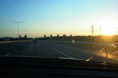
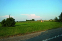
A motorway and its elements are so pragmatic, so fixed and determined that there is no place for emotions, experiences or art. Or Estonian motorways run through breathtakingly beautiful landscapes of fields, dotted by solitary houses, many of which are in rather dismal condition. You see an occasional abandoned windmill, a derelict barn, which seem picturesque. Flocks of birds fly above the motorway and animals wander by the roadside. It makes a lovely picture, unless they dash in front of your car. The storks’ nests are wonderful sights, especially in spring, when the chicks peer out from the nests. The autumn forests are joyously colourful.
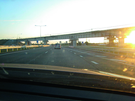
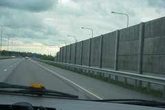
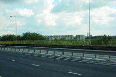
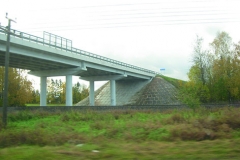
A motorway is a black ribbon running through a landscape, connecting different places as directly as possible. It requires certain signposts and traffic signs, with precise measurements and design. There are cameras that record speeders, which startle drivers and make them curse. At some crossroads, the ribbon is disrupted by a viaduct or a bridge, mostly untouched by an architect or the pragmatic drawing of an engineer. An engineer’s construction can be highly aesthetic, although this is quite rare on Estonian motorways. New village landscapes are separated from the motorway by dull traffic noise barriers, which hide houses and landscapes. In building a motorway, only the necessary work is done or, to be precise, as little as possible. It is expensive as it is.
A motorway comes with such structures as bridges, waiting shelters, noise and other barriers – engineering structures with a certain purpose that also have to meet requirements regarding appearance. There are two possibilities that are not mutually exclusive: involving architects and designers, and training road engineers. The Road Administration has organised competitions for traffic nodes, bridges and bus pavilions, together with the Tallinn University of Applied Sciences. Study programmes for road engineers include such specialities as the landscape design of roads, the aesthetics of roads and the architecture of bridges. Instructions regarding these areas are being compiled in Estonian, but many manuals and instructions in English, Russian, Finnish, German, Swedish and Danish are available. Until their own manual is complete, the Road Administration has continued translating various foreign publications. It must be admitted, however, that road art is still in its infancy.•
Stop
On a tiring journey, a driver expects to see some signs: half the trip is done, here is a small pub and petrol station – I will make a stop, have a cup of coffee and fill up the car as well; two thirds done – I will have something to eat before getting to town… The driver’s landmarks are roadside structures: places to eat, petrol stations and shops.
A roadside pub full of travellers has its very own charm, an aura different than an evening place of entertainment in a city centre. Here, people stop by, and brief encounters take place. After a long journey, especially on your own, it is nice to sit and look at a more static picture than oncoming cars, or trees and houses zipping past, browse through a newspaper, exchange a few words with the bartender, and spend some time with others in the same room. Many frequent travellers have their favourite places for stopping and enjoying a brief coffee break, even if the trip is not too long. Sometimes when sleep threatens to overcome the driver, this is absolutely essential. The newer the motorway, the fewer opportunities to stop. There may not even be a ‘forest stop’ on a motorway …
The main aim in establishing places for stopping and resting, car parks and control squares is to ensure traffic safety, providing drivers with opportunities to rest for various periods of time (10–20 minutes, a few hours or overnight). Service is possible when enterprises are able to offer it (cafes, canteens, sanitary facilities, shops, motels etc.). The decisive factors are the number of clients and the complexity of establishing utility networks. Control squares for customs, police and border guards have special requirements. The emotional aspect of designing car parks, toilets etc. near sights is important, although traffic safety is essential as well – directing people from the motorway to a safe place!•
The motorway feeds pub-keepers and salesmen, and offers work to locals; the disappearance of a motorway near such an establishment usually leads to its closure. People going to Narva no longer pass by the Viitna pub, as a direct motorway takes them quickly to their destination. The petrol stations and eateries at the Mäo crossroads have long been forgotten. The same is true of the monument to policemen killed in action; only the locals still remember the sad incident. The former Tallinn-to-Tartu motorway sign is difficult to find even when you make a special effort. Oops! – were we supposed to turn off here? You do not get another chance. The new fast car world does not like stops. The Mäo detour is first-class, high-quality, straight, smooth and wide, 0.7 km shorter than the old motorway and it saves you 1.5 minutes. You could enjoy your coffee for 1.5 minutes longer if only this were possible. Still, a few places pop up, later. Constructing the multilevel detour cost 475 million Estonian crowns. Was it worth it?
Profitability calculations are not really carried out afterwards without a good reason, because that is expensive. Nobody has asked for such a calculation for Mäo, although such calculations were ordered by the European Commission for the even more expensive and complicated Kukruse-Jõhvi section of motorway that was completed the same year. The result was positive.
Amongst other things, the design stage requires a public introduction and discussion of the preliminary project, and therefore local people had a chance to examine the planned changes and make their own suggestions, some of which were taken into consideration in later work. The Road Administration has always taken into account suggestions for improving the motorway sign system, and it is still perfectly possible to visit the Viitna pub.•
Danger
Too many people die on motorways. Motorway safety is crucial. But what is a safe motorway? Are four straight lanes, which encourage a ‘heavy foot’, the best possible option? Why promote racing?
The biggest percentage of motorway accidents are caused by driving off the road (24%) and collisions with an oncoming car (34%) – essentially the same accident, depending on in which direction the car veers. Then come speeding (overtaking) and tiredness. By making motorways wider, everything is done to increase speed, to make the motorway duller, to make stopping as uncomfortable as possible.
Overtaking on a four-lane motorway is less dangerous than on a two-lane motorway, but perhaps there is another, less expensive and smarter way to design a safe motorway? I have driven along three-lane motorways in the Nordic countries – the excellently signposted middle lane enables drivers to safely overtake, coming from one or the other direction. If, for instance, the Tartu-Tallinn motorway had been expanded by only one lane, would that have been a worse solution? For the money spent on the detour, a much longer safe section of the motorway could have been completed and the eateries on the Mäo crossroads and the petrol station would have been spared.
The Road Administration has considered building three-lane (2+1) motorway sections, but for various reasons these plans have not been realised. The option, however, is still under consideration for both the Tallinn-Pärnu motorway and Tallinn-Tartu motorway •
Motorway construction is not much discussed in public; it is carried out according to regulations, norms and calculations. Man as a sensate creature is forgotten, not only when planning motorways, but also when planning urban traffic. Every time I go to the Museum of Architecture, I think that the Estonian traffic planners are stuck in the past, but not far enough in the past. It would be difficult to imagine anything more inhuman than the relatively recently created junction area of Mere Avenue, Põhja Avenue, Rannamäe Road and Sadama Street. Obviously everything was done according to rules and regulations. Only the pedestrian was forgotten in this jungle.
Motorway art
At the wheel, I often entertain myself with thoughts of what could be achieved if our miserable Percentage Law were extended from buildings constructed by the state to motorway construction. From 1992 to 2012, 7795.9 km of motorways were constructed or improved, of which 5137.9 km are asphalt. According to the Road Administration, one kilometre of a four-lane motorway would today cost between 3.2 and 6.4 million euros, depending on the number of bridges, viaducts, culverts etc. If some mysterious power could allocate 1% for motorway art, that would considerably change the appearance of motorways. If only we could have half a per cent! Motorway art would be the field with the largest number of viewers, and this would have both emotional and practical benefits in keeping drivers alert. The Saue viaduct, for example, under which I often drive to get to Pärnu Road, could be redesigned by a theatre artist: you would suddenly find yourself driving through a grand stage portal – what an experience! At night, plays of light could be created under a bridge, something like on the Metroplaza façade in Tallinn; that would attract the driver’s attention and alleviate driver fatigue. There is a place near Suurupi where a deer track crosses the Rannamõisa motorway. Many animals have been killed there and quite a few drivers have lost control of their cars. The image of an elk in a red triangle does not make drivers reduce their speed – the motorways between forests are full of such signs. But what if a large modern welded elk was commissioned from an artist which was impossible not to notice?
To design an unusual noise barrier would be the perfect task for a designer, architect or landscape architect. Unfortunately, noise barriers are not seen as needing the help of artists. Noise is obstructed by cheap planks and standard details. The Mäo bypass has a fine noise barrier made of limestone. For the money spent on this, something splendid, and no less practical, could have been created.
In several contexts, I have recalled the works produced during the urban installation festival LIFT11. Something similar could be done for the motorways as well, perhaps a motorway installation festival MIF14. It would be possible to create something like Raul Kalvo’s Investigators in the Lasnamäe residential area, but perhaps even bigger and using more durable material. Or, perhaps under a viaduct, something like the world’s biggest wind chimes, The Sound in the City Hall tunnel, which consisted of 10 000 charity bells fixed to a net. Tomomi Hayashi’s To the Sea could have a successor, To the Field: a viewing platform in a beautiful spot in nature above a golden cornfield.
We could fantasise for ever.
A boring journey, alas, leads to no protests or complaints.
First impression
Designing a motorway (or rather not designing it) is not primarily a question of money; it is a way of thinking about motorways as a serious pursuit for a motorway engineer, and a bohemian touch is not appreciated. Money goes into crushed stone and asphalt, and beauty’s place is in an exhibition hall.
And yet a motorway is the first impression of a country for visitors arriving by car. The first impression is one of the few things that can never be changed. It deserves thought while planning an entry to a country or a town.
A motorway includes road architecture: houses lining the road, seen at high speed. It is the common opinion that roadside architecture can be a shabby tin hangar, a squalid industrial building or a world of storehouses with filthy surroundings. A town, especially an important one, must be pretty; architecture is expected there, but otherwise entrepreneurs have a fairly free hand in building cheap rubbish and in making things worse, including ghastly tasteless advertisements.
In the last few years, I have been busy photographing entries to towns and the result is far from what you might call ‘inviting’. The unchangeable first impression is quite revolting. People arriving, for example, in lovely Haapsalu are greeted by an awful Soviet-era building, with no indication whatsoever of the historical idyllic wooden town. The first instinct is to flee. Most entries to towns, however, are ruined before you even reach the town borders.
Townspeople should have greater rights to express their opinions about designing their surroundings. Rural municipalities are happy about enterprises operating on their land and filling the municipalities’ pockets, but they do not take any responsibility for what kind of impressions people might get when they enter the town. Businesses naturally want to be as close to town as possible. Towns are often unconcerned about what the area outside their limits looks like. Most towns have no town architect (or the person is not properly qualified), who would be able to influence the image of the place, and thus the border areas are ruled by chaos and a sense of total indifference. No appealing ‘welcome!’ gates.
Entering Tallinn from the direction of Narva is so repellent that there is almost something Stalkerish about it, the aesthetics of the ugly: ugly non-designed industrial complexes, sad old high-rise buildings, with long rows of ominous rail tankers in front. There are no people walking around there.
Coming to Tallinn from Tartu, however, is quite nice: Valve Pormeister’s pretty landscape-road architecture of the University of Life Sciences, which greeted the arrivals for decades, was supplemented four years ago by an attractive sports building created by Salto Architects. The university’s sports building is among the best examples of Estonian road architecture, created specifically to be seen while driving along the motorway.
Arriving in Tallinn from Pärnu is not too bad either: there is a rather decent gate motif that welcomes arriving drivers, also showing the time and speed – excellent! However, the landscape in front of and behind the gate is random and unfortunately was not thought through. There are a few nice examples of industrial architecture: the Neiser concrete production building in Laagri by Indrek Näkk, which is too far away to be appreciated from the road, and Raivo Puusepp’s DSV Transport’s centre of logistics in glimmering bright colours. It is possible to play around with colours in road architecture, creating an attractive and quickly graspable architecture. Alas, there are only a few good examples. Producing architecture of industrial buildings and storehouses is just as big a challenge to an architect as creating other types of buildings. Alas, it seems that architects were not deemed necessary in building many industrial complexes.
Streets
Just like motorways, streets too have been constructed along standard lines: asphalt or one of the three concrete stones on the market, about ten cents a kerbstone, standard barriers and entry obstacles, and the usual lighting. Some fascinating pedestrian streets and squares have been built (e.g Rüütli Street in Tartu, the central square in Rakvere, and the seaside promenade in Haapsalu), but these are exceptions, i.e independent art projects. In planning the common street space, the help of designers and architects is not required. The norms determine how and what.
Whether the existing street standards secure the necessary options of movement for everybody, whether it is necessary to separate the pavement with a kerbstone from the road, how to design street elements, how often people should be able to rest their feet in the street, how to bring life to streets – generally no effort is devoted to these considerations, even when there is occasionally an architectural competition. Instead of adding architecture courses at the Tallinn University of Technology, which already exist at a very high level at the Academy of Arts, the University should train street engineers who are infinitely more innovative, emphatic and creative, and ready to cooperate. Estonia desperately needs educated street designers!
The wind and blizzard have ceased, for the time being, and the snow and icy bumps have started to melt. The motorway is once again emotionless, long and boring.
• Excerpts from my correspondence with the Road Administration in March 2013.
• The law of commissioning artworks regulating the obligation of commissioning artworks for public buildings that aesthetically enrich the public space (passed on 17 June 2010).

